Styling official starters
Overview
A Theme is what makes it possible to change the look and feel of a FastStore official Starter. It is what differentiates one UI from another and where the store branding lives. In practice, Themes are CSS stylesheets consisting of configurable design tokens.
Design tokens can be classified as global or local, as presented in the following:

- Global tokens - structural styles responsible for establishing the behavior (e.g., showing/hiding a dropdown menu) and design pattern of a component.
- Local tokens - a set of configurable design tokens responsible for defining the appearance of graphical elements, such as typography, type scale, colors, borders, spacing, and more.
Usage
By default, every FastStore Starter comes with the Brandless theme.
The Brandless theme does not specify any local tokens. It is composed only of structural styles defined by global tokens.
You may wish, however, to use a different color palette, grid layout, or font style. To use a custom theme, change the theme property in the store.config.js file:
theme: 'midnight',
You can either use one of the available themes, extend an existing theme with additional styles or create a new custom theme from scratch.
List of themes
FastStore available themes include:
| Name | Preview |
|---|---|
| Soft Blue |  |
| Midnight |  |
Theming architecture
Starting from the bottom up, we have the components. Each component has its own CSS stylesheet scoped into a template that controls the component's final appearance.
Each template specifies local design tokens using global tokens as variable values. Take the following example of local design tokens defined within the template of the OutOfStock component:
  // Title
  --fs-out-of-stock-title-margin-bottom   : var(--fs-spacing-0);
  --fs-out-of-stock-title-size            : var(--fs-text-size-lead);
  --fs-out-of-stock-title-weight          : var(--fs-text-weight-bold);
  --fs-out-of-stock-title-color           : var(--fs-color-success-text);
Token naming scheme
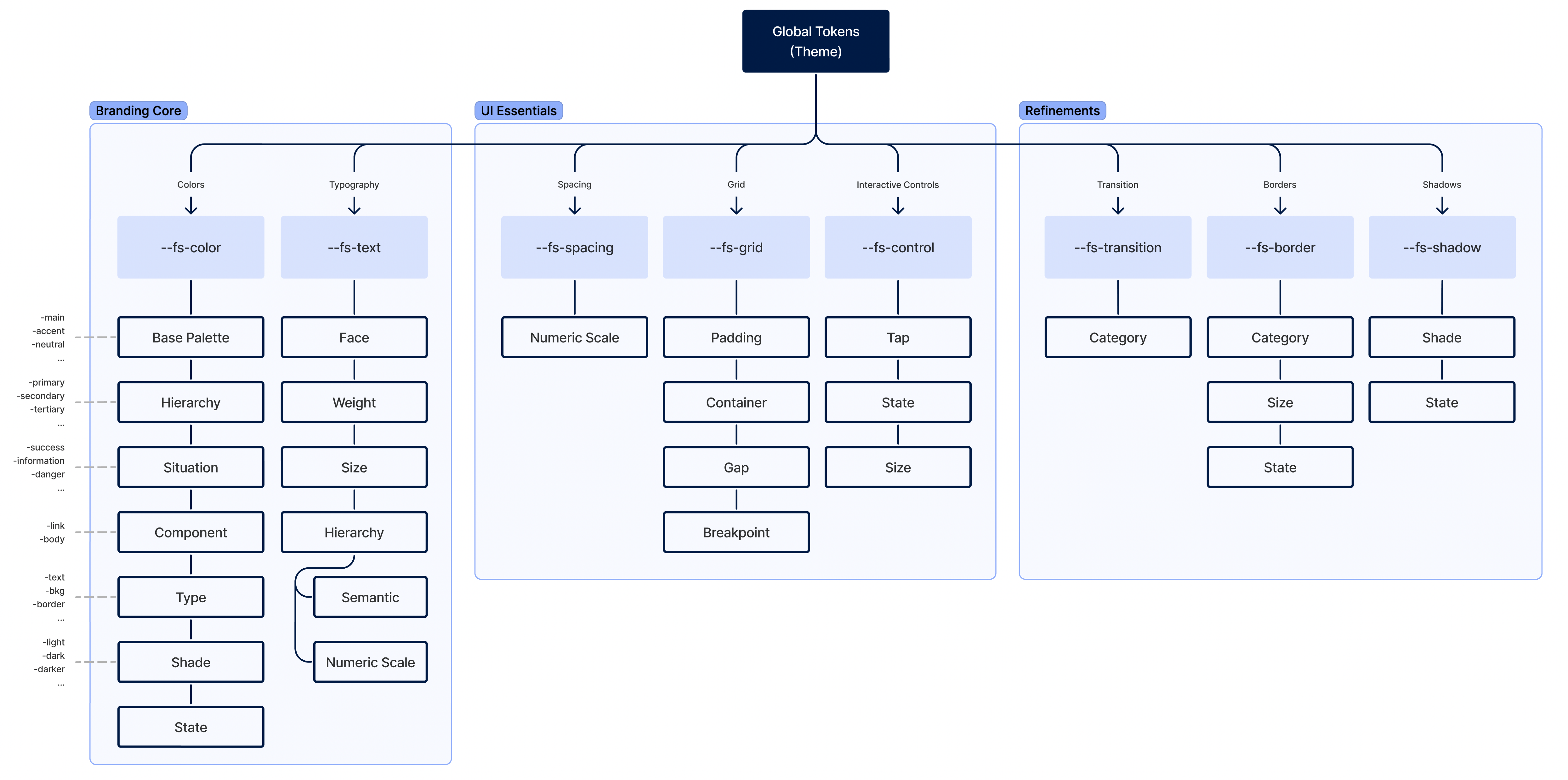
Global tokens
Global design tokens are parameters that affect the whole UI's look and feel. They are the main configuration file of a Theme.
Global design tokens are divided into three main groups:
- Branding core - colors and typography.
- UI essentials - spacing, grid, and interactive controls.
- Refinements - transitions, borders, and shadows.
The naming scheme for global tokens is presented in the following:
Local tokens
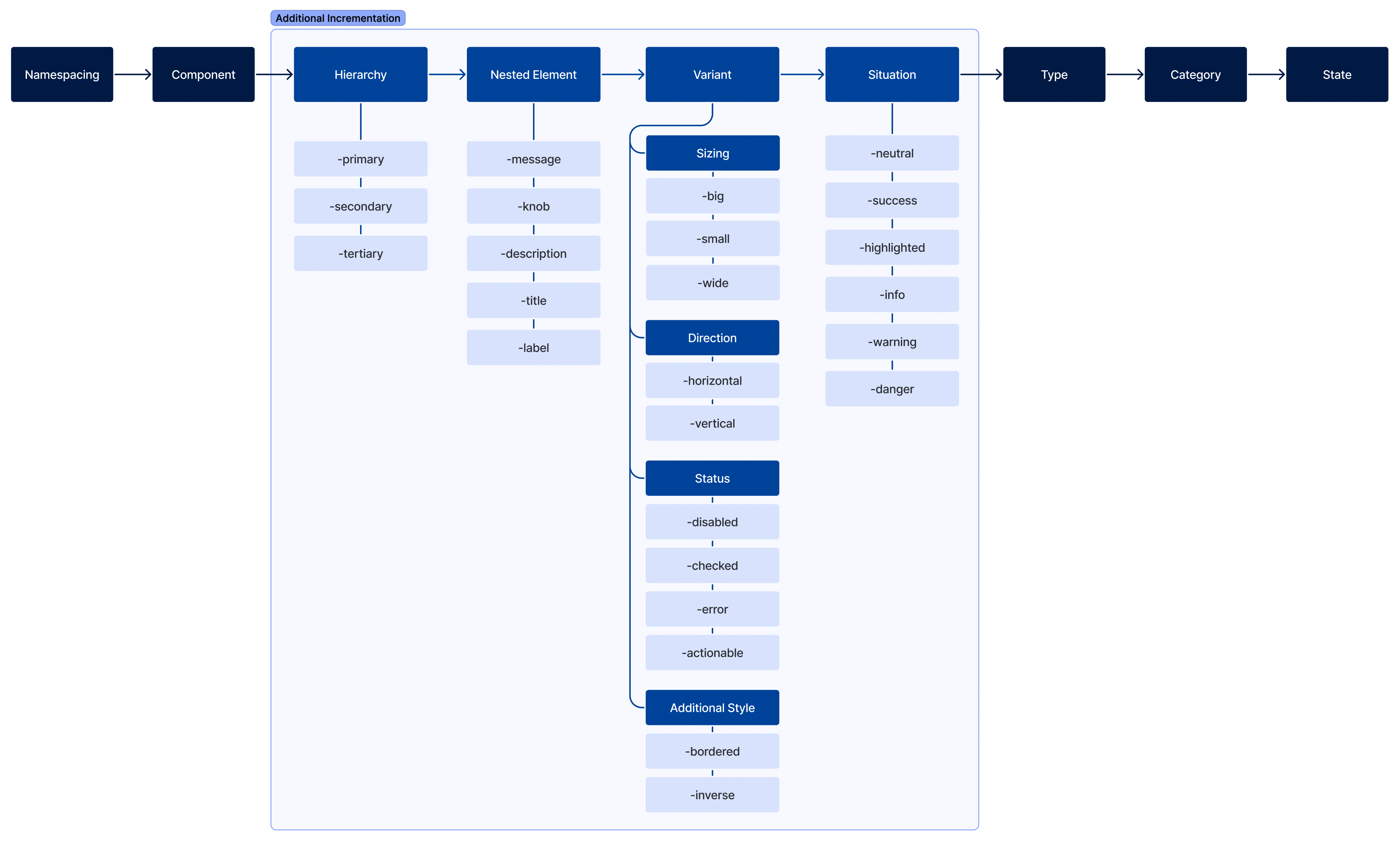
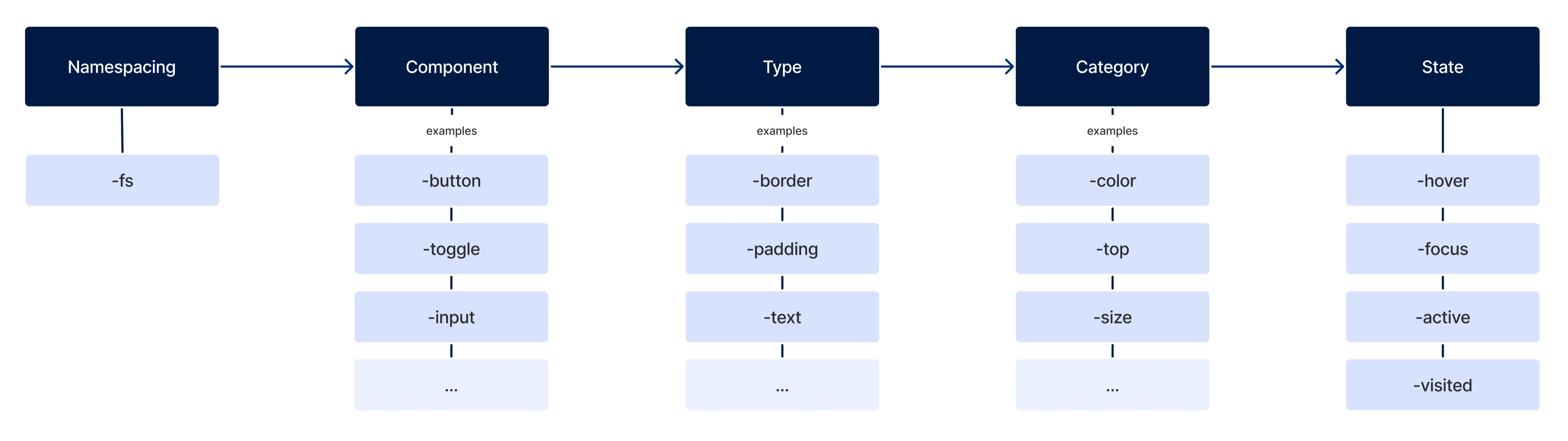
Local design tokens follow a strict naming scheme as presented in the following:
--{namespace}-{component}-{type}-{category}-{state}
- Namespace: Token's source (e.g.:
fs). - Component: Token's semantic meaning (e.g.,
button). - Type: Token's property type (e.g.,
border). - Category Category of the token's affected type (e.g.,
color). - State: Token's interactive state (e.g.,
hover).
In some cases, some optional values can also be added to the token's name:
--{namespace}-{component}-{hierarchy}-{nested-element}-{variant}-{situation}-{type}-{category}-{state}
- Hierarchy: Token's tier (e.g.,
primary). - Nested element: Element contained within the component and affected by the token (e.g.,
label). - Variant: Component's variant (e.g.,
wide). - Situation: Usage case (e.g.,
warning).