Components
Atoms
Badge
Status descriptors used to emphasize an item's state.
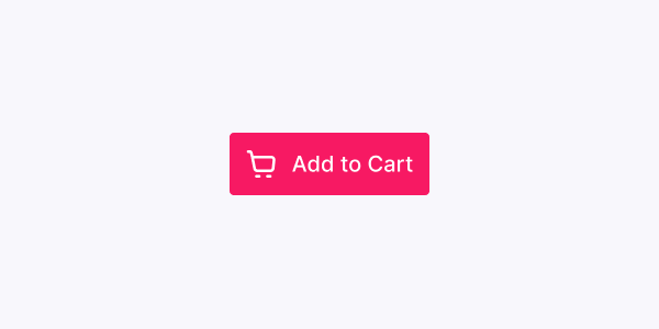
Button
Buttons indicate actions that users can take.

Checkbox
Checkboxes allow users to toggle an option on or off.
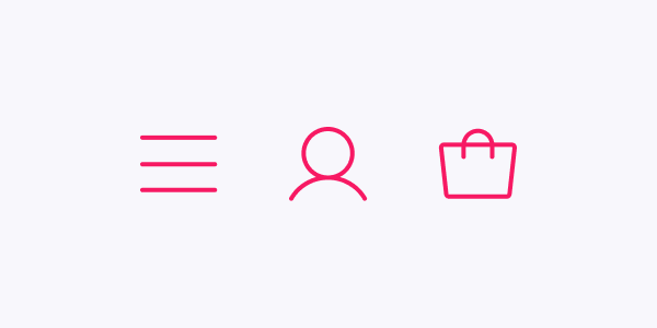
Icon
Icons are simplified graphics used to help users navigate the UI.
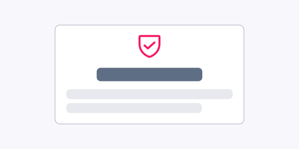
Incentive
Incentive is a badge or seal used to build trust among your potential customers.
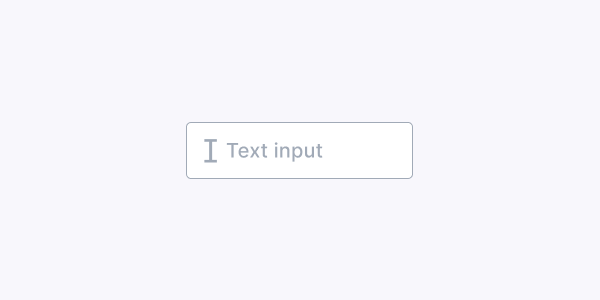
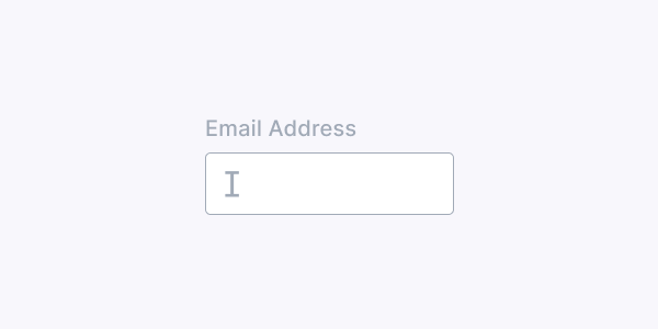
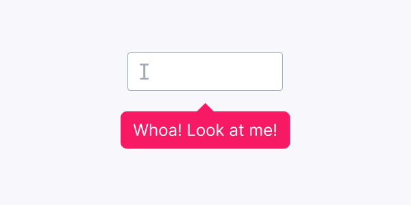
Input
Inputs are text fields used to get user inputs.
Label
Labels describe the meaning of input fields.
Link
Links allow users to easily navigate through web pages.
List
Lists group related content. They can be ordered or unordered.
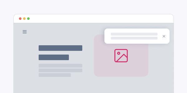
Overlay
Overlays provide contextual information on top of the current layer of the interface.
Popover
Popovers display contextual information on top of a component.
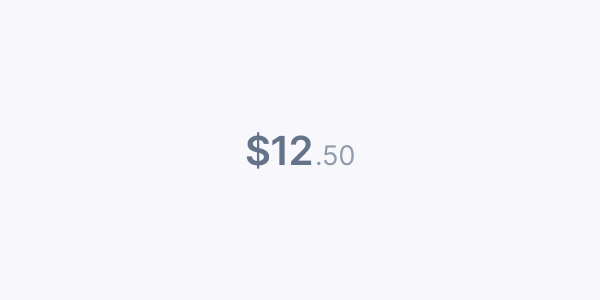
Price
Prices are used to display the price of a given product, discount and total values.

Radio
Radios allow users to select one option from a set.
SROnly
Hides an element visually. Improve accessibility by providing text to screen readers when applied.

Select
Selects allow users to pick an option from a predefined list.
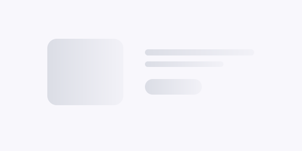
Skeleton
Skeletons are placeholders that indicate the content data is loading.
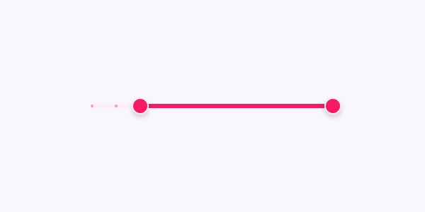
Slider
Sliders allow users to select a single value from a range.
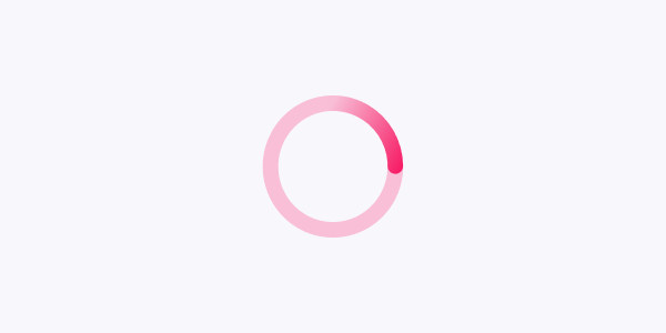
Spinner
Spinners provide a visual cue that an action is being processed.
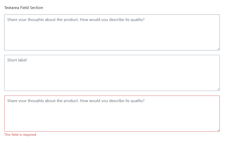
TextArea
TextArea components allow users to enter and edit text in a given field.
Molecules
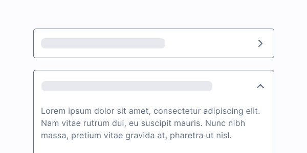
Accordion
Accordions display an expandable/collapsible list of items.

AggregateRating
AggregateRating displays a product rating based on other shoppers' feedback.
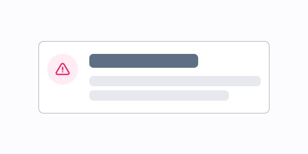
Alert
Alerts display short messages related to the behavior of a system, feature or page.
Banner
Banners are used for advertising brands, products, and/or collections.
Breadcrumb
Breadcrumbs indicate the user's location in a website hierarchy.
Bullets
Bullets allow users to alternate between different screens of a component.
BuyButton
BuyButton intends to send the user to the checkout/cart step directly.
Card
Cards are used to present content and actions related to a single topic.
Carousel
Carousels are a set of rotating banners with navigational controls.
CheckboxField
CheckboxField grouped a Checkbox input and its corresponding Label.
DiscountBadge
A custom `Badge` that display product's discounts.
Dropdown
Dropdowns are used to reveal a list of options or commands.
Form
Forms contain interactive components that are used to collect user input.
IconButton
Icon Buttons are buttons that use icons instead of labels.
InputField
InputFields are text fields used to get user inputs.
LinkButton
LinkButton is similar to a button, however acts as a link to navigate users between pages.

LoadingButton
Loading Buttons provide a visual cue that an action is being processed.
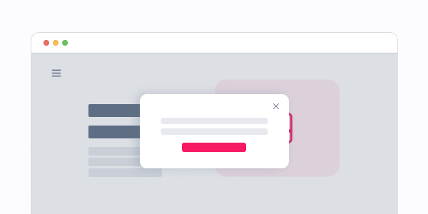
Modal
Modals are dialog windows that sit on top of an application's main view.
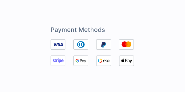
PaymentMethods
Payment Methods display the logos of the available payment options in a store.
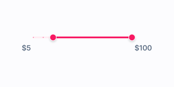
PriceRange
Price Ranges are sliders that allows users to select a maximum and minimum price.
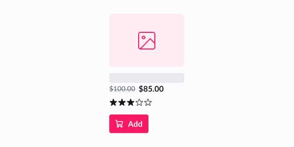
ProductCard
ProductCard displays summarized information about a product.
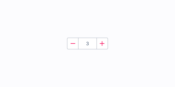
QuantitySelector
Quantity Selectors allow shoppers to choose the quantity of a product to buy.
RadioField
RadioField grouped a Radio input and its corresponding Label.
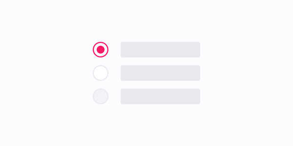
RadioGroup
Radio Groups allow selecting an option from a list of mutually exclusive options.
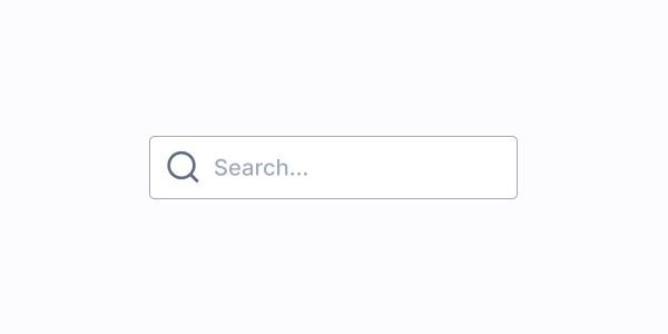
SearchInput
Search Inputs allow users to enter an input and query results from a database.
SelectField
SelectField grouped a Select input and its corresponding Label.
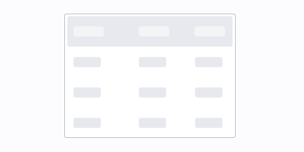
Table
Tables display information in a friendly way, allowing users to scan for details quickly.
Tag
Interactive badges.
Toggle
Toggle is a customized checkbox input styled to look like a switch button.
ToggleField
ToggleField group a Toggle input and its corresponding Label.

